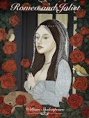
2011 Adobe Design Achievement Awards // call for entries
Wednesday, March 9, 2011
The Adobe Design Achievement Awards recognize innovative students and faculty members who AMAZE the world. Finalists will receive Adobe software and a trip to Taipei, Taiwan, where they will be honored in an awards ceremony during the 2011 IDA Congress set for October, 24-26, 2011. Category winners also will receive a cash award of US$3,000.
Competition is FREE to enter and open to all students, faculty and staff of higher education institutions around the world. Participants may submit up to 2 times in 15 different categories and 3 faculty categories. All student categories except for Web Analytics and Mobile Analytics* will be judged throughout the competition year. Students are able to submit in three judging sessions and semifinalists will be selected during each judging session. Students are advised to submit their projects for every academic term from May 2010 through June 2011.
ENTER ONLINE AT: www.adobeawards.com
Getting Published Class
Sunday, March 6, 2011
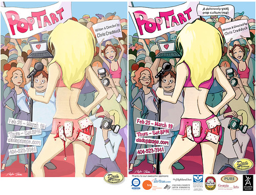
Getting published for the first time is a daunting task for some illustration students. Most clients want to work with artists that have already been published so how do you get published in the first place? It usually happens when someone really believes in your work and they take a chance having your art representing their product or service. One way to help this process is the Getting Published class offered at SCAD for undergrad Illustration Seniors. This past Fall I contacted the Marketing Director, Linnea Frye, of Dad’s Garage here in Atlanta, GA. “It’s a thriving mid-size theatre producing innovative, scripted and improvised works that are recognized locally, nationally and internationally for being undeniably awesome.” They had a funny play, “PopTart”, coming up in February 2011 they needed art for. Linnea was kind enough to come to class for an initial meeting to discuss the project with the students. Then the students got busy creating the best poster they could using the illustration process based on the requirements. Then it was then Linnea’s job to pick the best poster. All the students did a great job coming up with a funny and provocative illustration to represent the humorous tone of PopTart. It was not until after the class ended that the decision was finally made the Taylor Battle’s piece was the best fit, but I was not quite there yet. Linnea had about 4 more sets of revisions for Taylor. Here’s the original submission by Taylor and the final poster after all the revisions. Because of all the revision’s Linnea was kind enough to pay Taylor the normal rate they would pay an illustrator to create the poster. In the end, it was a great experience to realize that every commission is a compromise and the importance of pleasing the one that’s paying you.
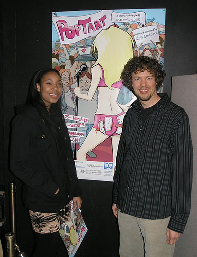
Dad’s Garage was generous to give the class free tickets to the show! This past Friday, March 4th, Taylor and another student from the class, Kelsey Thor and I experienced a very funny play about pop culture, celebrity worship and the internet.
It was really exciting for Taylor and I to see her hard work in an over sized poster for all to see. I highly recommend you checking it out before it before the last show on March 19th. We hope to continue to work with Dad’s Garage and other theater company’s in town to create many other win-win scenarios.
Labels:
careers,
event,
student work
Rolling Stone Magazine Reviews Project
Wednesday, March 2, 2011
Steven Charny, Senior Art Director for Rolling Stone Magazine visited SCAD's Savannah and Atlanta campuses this fall quarter. He gave a very interesting presentation and lecture about his early career, and especially his time at Rolling Stone. He and Professor Julie Lieberman, from the Savannah campus, put together a project with SCAD Illustration students from Savannah and Atlanta to create illustrations for the illustration-driven Reviews section of the magazine.
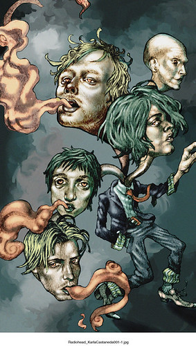
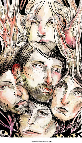
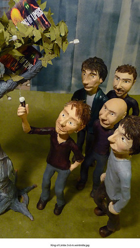
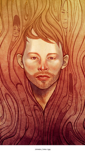
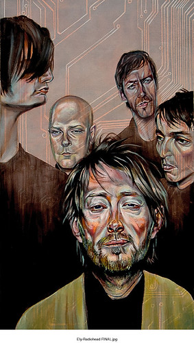
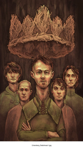
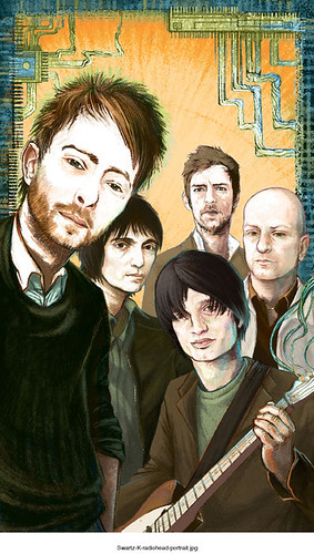
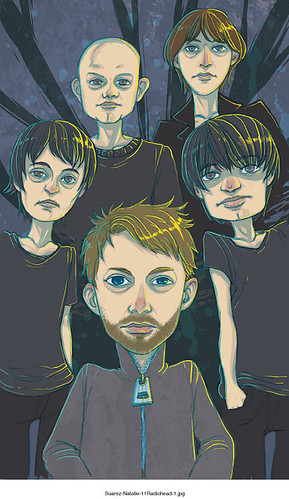
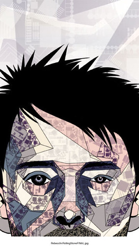
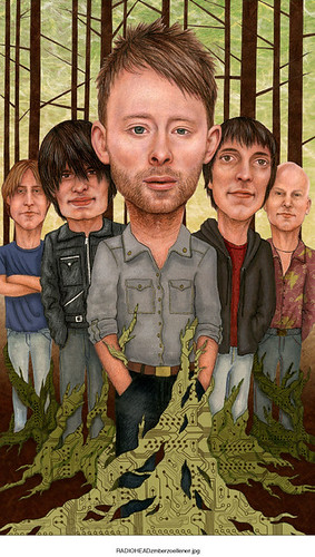
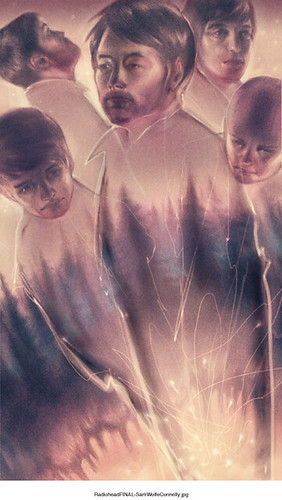
Initially, the project was to be in support of an article about Avril Lavigne's new release "Goodbye Lullaby". But just as the project got underway, the news broke that megaband Radiohead was to release their new album, "The King of Limbs" this year. So, the project quickly shifted gears and became a Radiohead illustration; Thom Yorke and the four other band members and some sort of reference, blatant or subliminal, to an ancient tree in the UK that the album pays homage to. The album takes its name from a 1,000-year-old tree in Wiltshire, England's Savernake Forest. That forest is found near Tottenham House, which is where the British band recorded part of "In Rainbows".So, students from both campuses submitted thumbnails to Steven, and he replied to each student who submitted, offering direction on every sketch. The students then polished their concepts on the strongest sketches and submitted them for approval. It was as real-world as it gets, complete with revisions, outright re-dos, and very tight deadlines, all the while having to produce flawless likenesses and smart, conceptually compelling images with professional quality execution.
Here are the results:
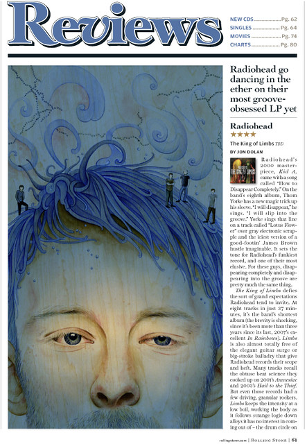
Solongo Mellecker's acrylics on wood painting was one of two that were given the highest student ratings. Steven said: "This one was definitely in the running. Just coincidentally it really fit well with the headline. The likeness is perfect and the color and technique are quite beautiful. I love the idea of actually painting it on wood grain. It really came down to this one and the Buzelli, but the art director picked the Buzelli. This is someone I could see using for something down the road. Nice job!".
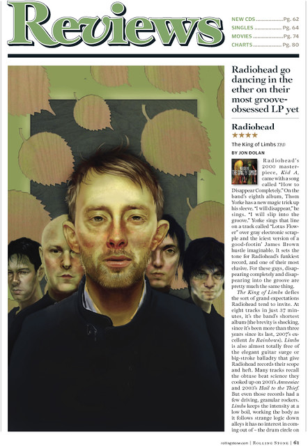
Kari Brooks' piece was also a very close contender. Here's what Steven said about Kari's beautiful digital painting: "This was one of the two really outstanding illustrations that could have easily been published by us. Really nicely done—good technique, perfect likenesses, nice composition, simple but on target."
Here are the other student submissions in no particular order:
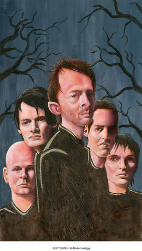
While the student work was very strong, they decided to go with a pro who was also working on the article. Here is the Chris Buzelli piece that will be published.
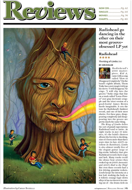
Congratulations to all who participated! All-in-all it was a very strong effort by everyone, and we are very proud of each of you. And thanks to Steven Charny of Rolling Stone and Prof. Julie Lieberman for facilitating this terrific project. It was a great experience for all, and I hope this can be an ongoing collaborative effort between the students of SCAD's Illustration Department and Rolling Stone Magazine for many years to come.
Subscribe to:
Posts (Atom)