
ICON5 just wrapped up it's NYC edition this weekend. It was a wonderful event, and this modest blog entry can't begin to give you a feel for how big and how inspiring it was. But I'll try.
First, you need to understand that this semi-annual event is all about Illustration; it is run by illustrators from top to bottom. No corporate suits are in charge, just folks who make a living making art as illustrators. You will see that most of the names are hot links, because all the folks involved are illustrators and have amazing websites and meaningful stories to tell. You owe it to yourselves to learn who these people are and take a look at the knee-buckling work they do. It's a humbling experience to be surrounded by such talented and dedicated people, and I came away inspired.
Know that what is presented here is a fraction of what was offered at ICON5; there were several events and outings going on at any given time, and attendees had to pick-and-choose which sessions we went to, so this is not a complete sketch of everything that was offered. I WISH I could have seen it all, but alas, I'm only mortal.
The event was at the Roosevelt Hotel just to the north of Grand Central Station at the corner of 45th and Madison Ave. A great location- easy to get to and from anywhere from the hotel.

The first person I saw at check-in was our old buddy James Jean. He was there to do the same digital coloring demo that we were privileged to see at the Arts Forum last February, and to sign copies of his terrific book "Process Recess".
The photo above is an overhead view of the grand hotel lobby at "The Teddy" as the locals affectionately call the hotel. Word is that there is a secret passage that was built into the hotel to whisk President Roosevelt away to Grand Central Station underground in case anything untoward was afoot and he needed to scram incognito; very turn-of-the-century James Bond stuff.
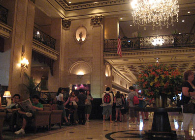
Another view from the lobby looking up at the Mezzanine Level where most of the ICON5 events took place.
I got into NY on Wednesday the 2nd of July, and was surprised to see that SCAD had created the bags for the goodies; there were SCAD bags everywhere!
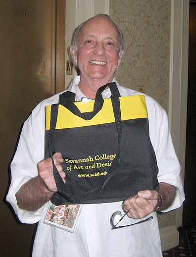
Look, even Marshall Arisman was proud to flaunt his SCAD bag!
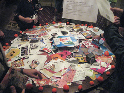
Up at the event lobby on the Mezzanine level, there was a big round table for people to leave their promo materials (I brought a bunch back for my Professional Practices classes). This picture is very telling, I think; this is pretty much what a big-time art director gets in a week's time in the mail. No wonder they throw most of it away. The trick is to set yourself apart from the pack with materials that are creative and sophisticated, or outrageously funny, or just shaped differently. See the dark cube at about 4 o'clock and again at about 10 o'clock? It stood out because it, well, stood out! It had dimension, it was interactive (it came flat and you had to assemble it to make it into a cube) and it was simply different. This promo was more likely to NOT end up in the round file, but might have even been displayed on the recipient's desk or window sill. And you could get 6 samples on the cube at the same time. Clever.
Self-promotion was the name of the game on Wednesday night with "The Road Show". That's where illustrators have reserved tables (booths) and display their portfolios and promos for all of the art buyers to come and see. It's a massive show-and-tell, but it's a great place to meet with the big art directors at one time and in one place. Networking happens here, and I recommend it to all newbies to the Illustration marketplace. It's scary and intimidating, but you'll learn a TON about marketing and you'll meet lots of other artists and art buyers, and you might even hook up with a rep while you're there (if you want to ;). Click the link above; it will take you to a page with the names and links to the websites of all the illustrators who attended... terrific resource.
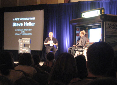
Steven Heller (left) interviewed Stanley Hainsworth for his podcast. Hainsworth has been creative director for biggies like Nike, Lego and Starbucks. Weird hair, slightly scary guy.
Thursday was given over to off-site studio tours. There were trips to lots of different venues and studios. I had signed up for the Sam Weber Studio Tour but the logistics for off-site trips were not well coordinated and I missed the tour... DANG! I heard from one of the attendees who made it to Sam's studio that he was amazed to learn that Sam's work is 100% traditional! Ink and watercolor... who knew? I would have bet the farm that it was at least twiddled with in Photoshop, but not so. Amazing.
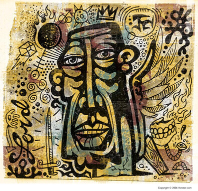
The first breakout session I attended was a digital texture workshop with a master, Von Glitschka. His website is a treasure trove of all things trendy and retro, and he's a very nice guy, to boot. He even offers sample files to download and drill through to see how he achieves his texture effects. Sweet!
Adobe reps then did a song-and-dance about the new stuff they are putting in CS4, and it looks pretty cool. No word on the release date, though.
There was a party Thursday night with the Halftones playing jazz on stage. They are a group of illustrators, too: Joe Ciardiello, Barry Blitt, Richard A. Goldberg, Hal Mayforth, Rob Saunders, Michael Sloan, and James Steinberg laid down some smooth tunes, and were actually quite good.
Friday was a big day. Nona (aka Victoria Roberts) started each morning with her hilarious Australian schtick.
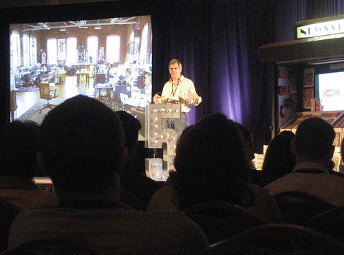
Then we were treated to "Dirty Girls and Cat Butts" with Mitch Nash (above), CEO of BlueQ. He convinced everyone that if you've got a raunchy sense of humor and a decent design sense, you can make a fortune. Have a look at the Cat Butt Magnets and the "Looking Good for Jesus" lip balm, as well as the rest of their wacky products. It's crazy, but they made 3mil off their Dirty Girl line alone, three years in a row, and their Miso Pretty line has won tons of illustration and packaging awards. He also mentioned a couple of cool websites: Gigposters and Scrojo... they're worth a peek.
For those of you who are interested in concept design for films and animation, three heavyweights spoke about their transitions from traditional, static illustration to working for the movies. Barry Jackson, Greg Spalenka and Stephan Martiniere showed their concept work and spoke about the opportunities for illustrators working in the film community. They offered some great advice: polish your storytelling skills, particularly with storyboarding. When developing characters, they need to have personality and attitude, not just cool costumes and fancy weapons. Learn to sketch quickly. How do you do that?.. practice! And draw, draw, draw. Lastly, learn the holy triad of concept art for film, gaming and animation: Maya, After Effects and Flash. The skillset required is daunting, but if you are a great technician with a flare for envisioning the future or the ethereal, there is BIG money in concept art. They threw around numbers like between $3k and $6k/week. Yikes!
Friday afternoon I was blown away in the session with Luba Lukova's presentation of her amazing poster work: "Social Response". She's Bulgarian by birth and witnessed the fall of the Iron Curtain firsthand, and understands better than most the issues that affect us as individuals and as a society. She's a joy to talk to and an inspirational designer and illustrator.
Daniel Pelavin held forth on Friday evening. He's the master of inventive and clever self-promotion techniques. He says that a $2600 sourcebook page is worth the same as a $2 doorstop at Ace Hardware; they serve exactly the same purpose. His suggestions are too numerous and complex to outline here, but the gist was that creative, unique, funny, memorable, and handmade are WAY better than run-of-the-mill postcard mailers and sourcebook ads. Oh, and a great website is an absolute MUST.
Friday was the 4th of July, so when in NY, you do as the NYers do...you go see the fireworks!
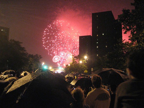
It was raining a bit and the barges eventually drifted down the East River behind apartment buildings obscuring the view, but we had a good time anyway.
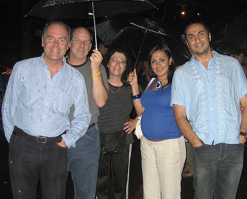
See how much fun we're having in the rain? That's the SCAD-SAV contingent:left to right: Allan Drummond, (Illustration Chair), Kurt and Marcie Vargo, and Naima and Mohamed Danawi. Yes, the Danawi's are expecting.
Saturday was another very busy day. Kristen Johnson presented a short film of an interview with the REAL art directors of the New Yorker; Caroline Mailhot and Chris Curry, and Art Editor Francois Mouly run the show as it pertains to all the wonderful illustration featured in the New Yorker. Laurie Rosenwald was the interviewer in the film.
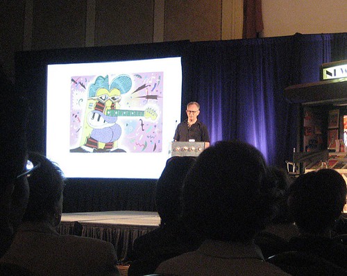
Gary Panter (above) was next, and he was a breath of even fresher air. He's the guy that did the set design for PeeWee's Playhouse! 'Nuff said, right? He also recently published a 9 pound book of his artwork that makes the Manhattan Phone Book look teensy. The guy's a machine.
Next came a remarkable video by Steve Brodner called "The Naked Campaign", which is Steve's very clever visual take on the current state of politics in America.
After that was a sobering but informative talk by Tad Crawford who is an attorney that specializes in copyright law and creative property law. He wrote the book on "Business and Legal Forms for Illustrators", which I have in digital form for anyone who asks for them.
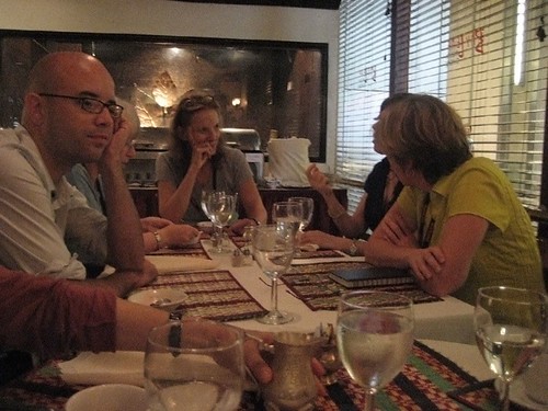
Lunch was a treat; Nancy Stahl was the illustrator who convinced me it was okay to embrace digital technology, and she hosted a lunch at a great Indian restaurant called Bay Leaf. The topic was officially "Paint, it ain't?", but we mostly just chatted about everything from Wacom tablets to tennis. That's Nancy at the end of the table with the glasses on her head.
After lunch, Marshall Arisman and Rudy Gutierrez presented their talk "Making Fire: Inspirational Teaching". Through personal anecdotes and revelations that changed their own views of life and art, they hammered home a few simple truths: Paint what you know. Be true to your own personal voice and vision. Never sell out by attempting to please others, but always make art that pleases you. And if you are inspired by an individual or an idea and that helps you formulate a goal, no matter how lofty, do whatever it takes to reach that goal. And that usually means a ton of hard work and a little luck.
The last event of the evening was "What do Children's Book Editors Want?" presented by Leonard S. Marcus. Marcus is a very well respected authority on children's books, and showed many examples of award winning (American) children's books. While the talk was informative, I was a bit disappointed that it was so very American in tone, and didn't touch on the wonderful works that are coming out of Europe, the Middle East, Latin America and the Pacific Rim. I guess that's just too much to cover in an hour.
The closing keynote was by a 3D Design teacher at SVA named Kevin O'Callaghan. He ia a type A++ personality that has his students doing mind-boggling things that are bringing international recognition to SVA. His talk featured a project his students did called "Yugo Next", in which O'Callaghan put a want-ad in the paper that said "Wanted- Yugos. Dead or Alive". He got dozens of responses, and bought enough Yugo's for the whole class to work on. It's worth a few minutes of your time to see what the students did with these heinous vehicles.
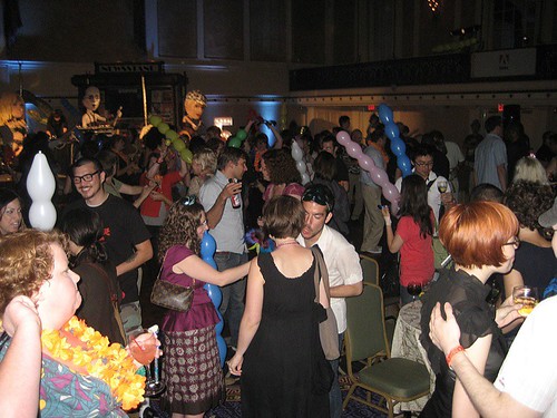
Saturday Night was the big Carnival Carioca party in which 500+ illustrators drink too much and then try to dance. It was not a pretty sight, but it was fun! Did I dance?.. I'll never tell.
Along the way I met some amazing illustrators and very nice folks. Here are a few who made a lasting impression...
Kim Rosen is a SCAD MFA alum who was recently featured in CA's "Fresh" column. She graduated in '04 and her client list looks like she's been in the biz for 20 years. She's a sweetheart, and does amazing artwork. She doesn't dance, by the way;-)
Michael Phillippi is also a SCAD grad who is now the lead Concept Artist for EA Mythic in Fairfax, VA. Not too shabby.
Genevieve Kote is a firebrand Canuck from Quebec City. To say she's prolific is an understatement.
Raymond E. Beisinger is another Canadian from Edmonton, Alberta. He does wonderful vector art with texture and attitude.
Lizzy Rockwell is a delightful children's book illustrator from New England.
Robin Kachatones, from Houston, is another terrific illustrator who was also at the Nancy Stahl lunch.
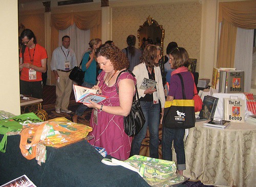
There was also a fabulous bookstore with tons of juicy stuff that I couldn't buy because my suitcase was already bursting at the seams. Thankfully, the bookstore remains open in a virtual sense!
Here are a few of the people who put this wonderful event together:
Whitney Sherman is the president of ICON (Illustration Conference) and maintained her composed and elegant demeanor despite the fact that she worked like a dog the entire time ;-)
Mark T. Smith was the sponsor coordinator. He's amazing, and looks very much unlike what you might expect from his artwork; he has the outward appearance of a very buttoned-down business type, and I assumed his work would be very mainstream...NOT!
Edel Rodriguez is an illustrator as well as an art director at Time Magazine. He did the artwork for the ICON5 Poster and program, which is gorgeous. He wrote this article in Drawger about ICON5. Funny photos, too.
Ross MacDonald, Fernanda Cohen, Isabelle Derveaux, Don Kilpatrick, are also on the ICON board and did a terrific job making everything run smoothly. There are others as well, and they can be found at the ICON5 website.

That's All Folks! Hope to see everyone again in 2010! In Savannah??




3 comments:
I'm so jealous and glad you got to go Rick. Great read and excellent links. Very inspiring indeed!
Waaahhh so many amazing artists there! I hope you had a TON of fun. :) Thanks for all the links..
Wow, Rick! I'm so jealous -- this looks like such a really fantastic event to attend. Thanks for letting us live vicariously through you this year. :)
Post a Comment