
Welcome to Beautiful Downtown Burbank! The flight into Burbank Airport was interesting... the runway was designed for small private planes but they allow MD80's to land there for some bizarre reason. It's essentially a crash landing then a full-on reverse thruster and brake effectiveness test until you hopefully, finally stop just short of a chain-link fence and the freeway at the end. Everyone was suddenly wide awake after the long flight. Then you disembark from the rear of the plane down a metal ladder onto the tarmac and walk under the running engines to the terminal which looks like it's a set from a 1950's movie. It's called Bob Hope Airport, and it hasn't been updated since he retired his Vaudeville act.
This, however, is why I came...

The Illustration Conference is a semi-annual event that brings together top illustrators, educators, art directors, representatives and art buyers to explore The Future of Illustration. This year's event, ICON6, was held in Pasadena, CA at the beautiful and gracious Langham Huntington Hotel.

My room was a cottage set apart from the main hotel by a covered bridge, called the Picture Bridge, that overlooks the pool on one side and a Japanese Garden on the other. This is a view of the pool from the bridge.

That's my cottage in the distance as seen from the Picture Bridge.

This is the Japanese Garden in front of my room. Not a bad place to be for a few days. It was unusually hot there in mid July, but the humidity is low so it isn't uncomfortable to be outside in the shade.
The first night, Wednesday, there were several things to do. There was a Chinatown Sketch Crawl hosted by Jeffrey Smith and Paul Rogers. There were lectures, a visit to the Clayton Brothers studio, a free-for-all soccer game, a rooftop cocktail party at Art Center, and a gallery visit to La Luz de Jesus. Guess which one I did...

Art Center College of Design is just a mile or two from the conference venue and the faculty there were instrumental in helping to organize this conference. Many students worked as interns as well. We didn't get to see much of the school because access was limited, but the rooftop party was very nice. We wanted to make it to La Luz de Jesus as well, but it got too late.
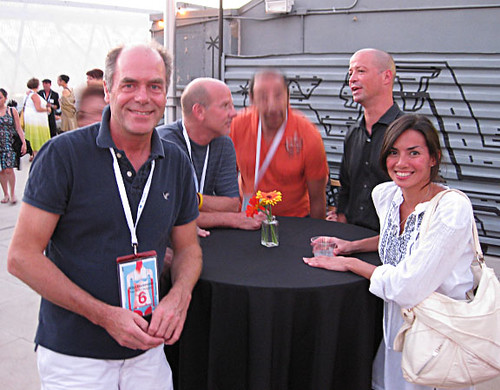
The gang from Savannah: l to r; Allan Drummond, Chair of Illustration, Kurt Vargo, faculty, Mohamed Danawi, faculty (vigorously agreeing to everything John Lowe is saying...smart man), John Lowe, Dean of Communication Arts, and Michelle Anderson, recruiter for the online degree programs.
I also met Hanoch Piven at the party... what a great guy, and I love his work.
Thursday
Thursday was dedicated to workshops. There were lots of offerings and it was difficult to choose which ones to go to, but I'm happy I got to see and meet Jeff Soto at his "Inspiration from the Fringe Artist Workshop".
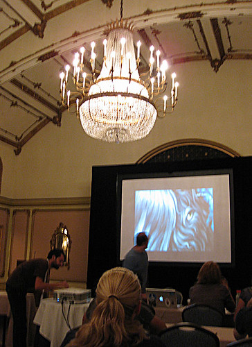
Everyone was marveling at the ballroom's ornately gilded vaulted ceiling and massive chandeliers which turned slightly whenever the air conditioners came on.
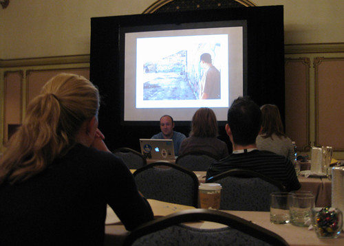
The first part of Jeff's presentation was a slide show. He spoke of his upbringing in semi-rural Southern California, his early influences, his love of graffiti, etc. He showed lots of examples of his childhood drawings, his high-school and early college work, and his early professional work as well as his more recent pieces, which are typically large-scale paintings and installations.
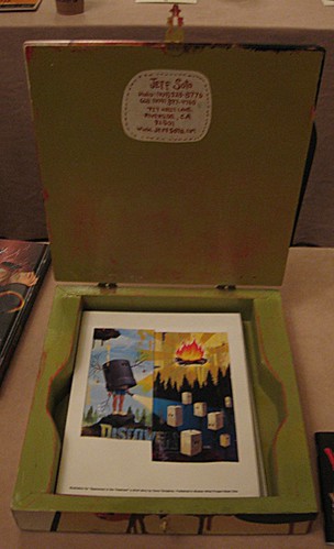
One very cool thing he showed was his portfolio that he carried when he was first starting out as an illustrator. It's a story I keep hearing from successful pros about how important it is to package your work in a distinctly personal and appropriate way for the market you want to enter. His is a handmade box that is decidedly Sotoesque...
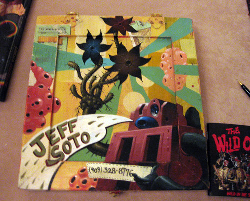
And here's the inside...
Jeff also did a painting demo.
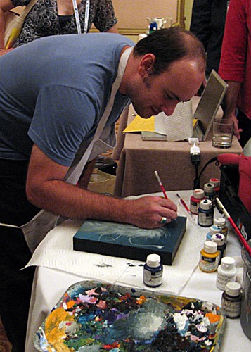
He uses acrylics on panels. His palette is a one of many lunch trays that he has a habit of stealing for just such usage.
Edel Rodriguez posted this photo of the completed demo painting:

In the afternoon I went to a workshop sponsored by Adobe, demonstrating the new features in CS5. Some pretty cool stuff there.
Thursday night was the Opening Ceremonies and a Howdy from Martha Rich, President and Mark Heflin, Director
The Opening Keynote Address was entitled "The Future of Publishing- The Great Transformation"
Here is the blurb on the ICON website...
Scott Dadich, Creative Director, WIRED; Kelly Doe, Art Director, The New York Times, Jim Heimann, Executive Editor, Taschen America, and Jeremy Clark, Senior Experience Design Manager, Adobe and moderated by Roger Black, Principal, Roger Black Studios
Brace yourself. In case you hadn’t noticed, technological tools such as the Kindle and iPad are changing the way we receive and read books, magazines and newspapers. Who will win and who will lose? Wait and see, but one thing is for certain: Publishing as we knew it has forever changed. Join these publishing pioneers as they discuss how the new chapter in media will change the way individuals and corporations deploy creative content — and pay for our creative work.
The discussion spurred a bit of an outcry from the audience when it was suggested by one of the speakers that in order to be relevant in this new digital delivery marketplace, we all need to know how to make our images move. Apparently, most illustrators don't want to become animators, too. I know I don't. Many in the audience felt that illustrators do just fine getting their point across with single frame, static images, thank you very much. However, it was suggested that it might be a good idea to work in such a way that would make it easy and economically feasible for an animator to add motion to illustrator's work. That means digitally, and in layers I assume. In any case, this debate will continue for some time, no doubt.
The two Emmcee's were Paul Rogers and Brian Rea, and each morning they kicked things off with some helpful information, such as how to get oriented to the distances between cities in the Los Angeles area, hence this helpful graphic...

It's more accurate than you think. The shuttle ride from the Burbank Airport to Pasadena felt like going from Bismark, ND to Buffalo, NY, just hotter.
The other interesting graphic they offered was also right on the money. It's a conversation translator for ICON attendees...
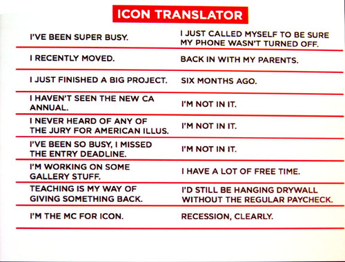
The statement in the left column appeared first, then the translation appeared in the right column. Very funny.
Thursday night was"The ICON6 Roadshow Artists Portfolio Salon", wherein illustrators pay for tables and lay out their promo materials while Art Directors and other buyers come in to see all the goodies and maybe hire you for some illustration work.
Friday
Friday Morning - continental breakfast and lots of coffee, then...
BDM, the smallish agency that did the groundbreaking animations and print work for United Airlines talked about that campaign and showed some inspiring animation and illustration.
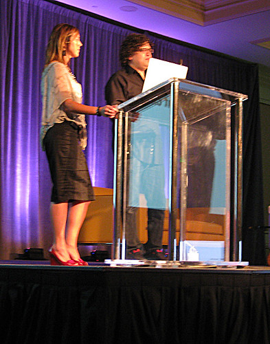
Kim Witczak and Stuart D'Rozario of Barrie D'Rozario Murphy.
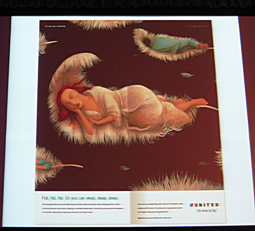
One of the print ads for United. They just gave the artists keywords like "flat" to describe the sleep seats available on transoceanic flights, and let them run with the idea.
This is one of their award-winning illustrated animations:
Different not Better: Increase the Value of your Illustrations Through Differentiation
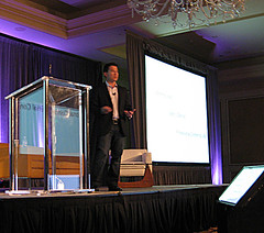
Dave Peterson spoke of ways differentiate yourself from the market.
Au Currant: Two with Passion for Fashion
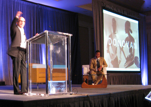
Bil Donovan (l) and John Jay Cabuay spoke of their careers in fashion illustration.
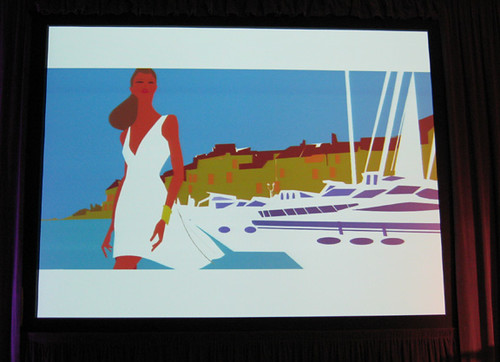
Bil Donovan
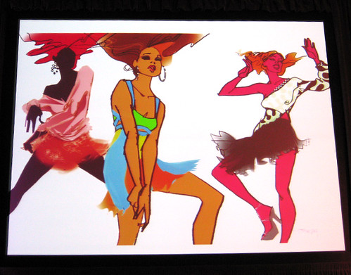
John Jay Cabuay
Cracking the Code: Making Sense of Contracts
Kathryn Adams had some very helpful translations of the legalese that is often confusing if not downright indecipherable in contracts. She sent me the text of her presentation and you can get it here.
Because You're Worth It: Price Negotiation
Maria Piscopo was next with ways to get more for your work. Her 7 tips are available here.
Before I go any further, you have to see Jason Holley's hilarious videos about the state of freelance illustration today. They played between sessions and kept everyone in stitches. They are available on Vimeo, and are worth a look.
Here's one for starters...
Interview from jason holley on Vimeo.
Then there were roundtable lunches that were offered, and I took advantage of them. The food was not so great (boxed ham sandwiches and such), but for the most part they were informative and useful. There were two roundtables per lunch session; about 1/2 hour at one group, then you'd go to another table for another group.
I went to one about how illustrators can become a cult brand in the fine art market. Meh...really didn't learn much.
Then I went to one hosted by Michael Fleischman about how important drawing skills are for illustrators. I believe it wholeheartedly, but I got the feeling he was really just pitching his new book.
The next day I shared a table with Tatiana EL-Khouri, who spoke about the importance of using social media in your marketing scheme. Good info, but nothing really new.
Then over to John Hendrix's table where the discussion was called "Navigating Two Worlds; Working in Both Editorial and Children's Publishing" (which he does very successfully). This one was great. John is very smart and very funny, and he had great tips on marketing yourself to these two very different types of clients. His handout is available here. A couple of important items; for working in the Children's market, you need an agent. They have all the inside contacts, know the market, and only take 10%. You don't need an agent to work successfully in the Editorial market, and besides, they can take 30 to 35% of your fee. Also, he said to be sure to send your promo materials to JUNIOR designers as well as the senior folks; they are more likely to be flattered and impressed that they were included in your mailing, and more likely to call you for a job.

That's John, going for some more Mrs. Vickers chips. (actually, he's signing a copy of one of his books)
Friday afternoon: these sessions were sponsored by SCAD, by the way!
Euro Smash; Illustration Across the Pond was presented by Rod Hunt, "one of England's most prolific illustrators working in publishing, advertising and editorial, talks about the illustration field in Europe- and more specifically London-, where to find work, how to promote, and how it compares to the market in the U.S."
Jeff Sedlik spoke about the Orphan Works issue and other legal updates.
Basking in the Glow? How Much is "Exposure" Really Worth?
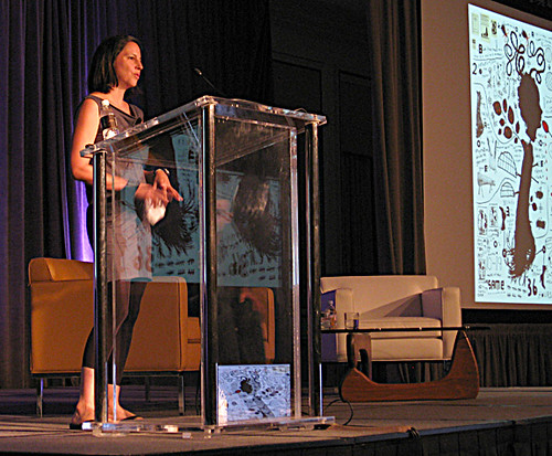
You might have read about this a while back. Remember when Google Chrome came out and they featured artists and illustrators work in their banner at the top of their browser? Well, they asked Melinda Beck to do one, and then they told her what they would pay her. Nothing. Zip. Nada. Said it would be "Great Exposure". Read the New York Times article to get the complete picture.
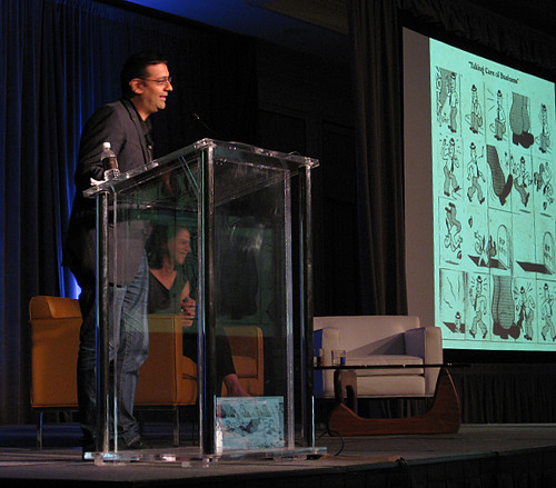
Gary Taxali had similar stories and a similar warning: don't work for free for any commercial, for-profit client just because it might be "good exposure". Non-profits, charitable organizations and causes that you believe in are one thing, but to work for free for a multi-billion dollar company like Google is insane, and ultimately bad for all illustrators as it sends a signal that we are all willing to work for nothing but "exposure".
Wayne White
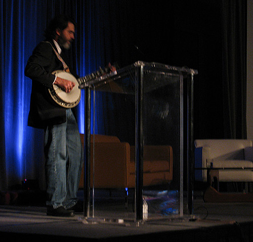
That's the name of the speaker and the name of the presentation, and if you were there, you'd know that there is nothing else that needs to be said. Here's what the ICON6 website says:
Wayne White’s painting and sculptures have been exhibited in galleries and museums across the world. He is a three-time Emmy winner for his set and puppet designs on “Pee-Wee’s Playhouse,” as well as an art director for music videos such as Peter Gabriel’s “Big Time” and the Smashing Pumpkin’s “Tonight, Tonight.” Recently he created an art installation of a 23-foot-long puppet head of the country music legend George Jones titled Big Lectric Fan To Keep Me Cool While I Sleep at Houston’s Rice University. A monograph of his 30-year-career Maybe Now I’ll Get The Respect I So Richly Deserve edited by Todd Oldham has just been published by Ammo Books.
He's a good 'ol boy from Chattanooga with lots of stories to tell, and I want to bring him here to SCAD sometime just to spread the joy.
A Life in Publishing from Hugo Cabret to Harry Potter

David Saylor spoke of his years with Scholastic Press, and showed an array of award winning books he has published.
Made You Look: The Evocative Books of Todd Oldham

Todd Oldham is a true renaissance man, and a very engaging speaker, to boot. His accomplishments are too numerous to mention here, but if you poke around his website for a while, you'll begin to get the picture, so to speak. His big ode to Illustration is his Charlie Harper an Illustrated Life book, which was a major endeavor and a huge, luscious book.
Friday Night: Gallery Nucleus
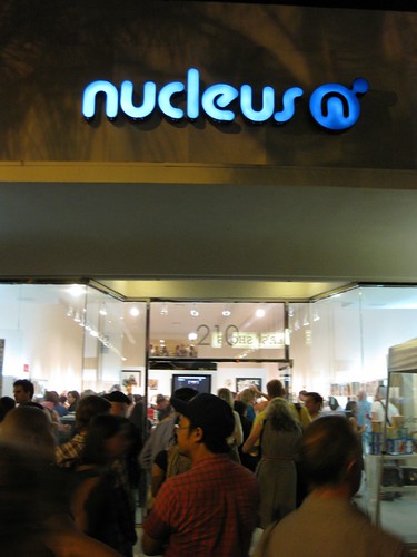
We took the hotel shuttle to Nucleus Gallery in Alhambra, not far from the Langham in Pasadena. The show had pieces from several heavy hitter illustrators such as...
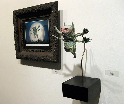
Red Nose Studio
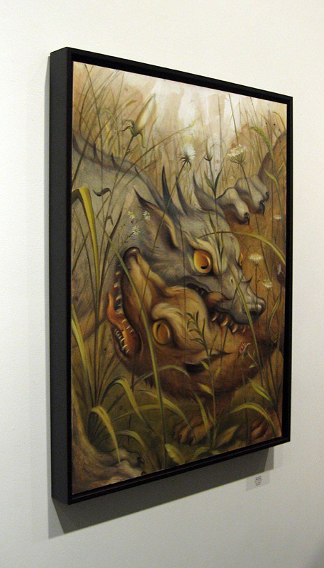
Chris Buzelli
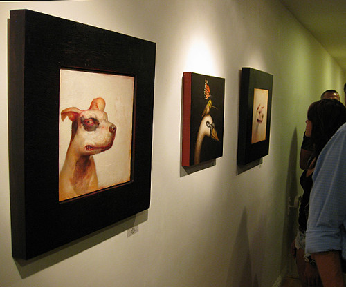
Tim O'Brien's Dellas Graphics burning frog, and others. One very cool surprise was seeing the work of SCAD-Atlanta's own Michael Brown...
Saturday
More coffee and pastries, then...
Transdisciplinary Cross Dressing: Illustration + Graphic Design
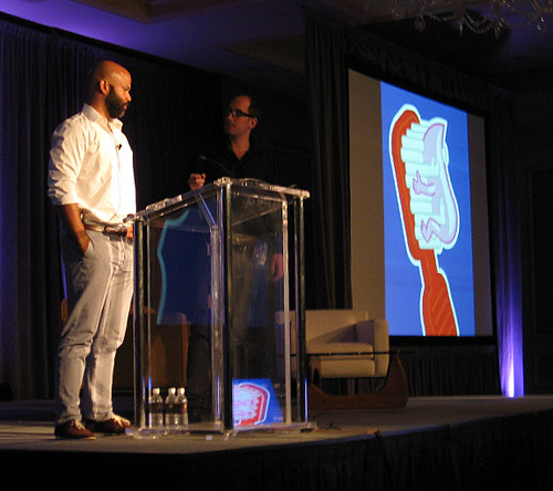
Arem Duplessis (l) and Christoph Niemann spoke about the confluence of Graphic Design and Illustration, and shared their philosophies about each discipline and how they are more similar than you think. One comment Christoph made was that he thinks of illustrative styles like a designer thinks of type faces; you use whatever is appropriate to solving the visual problem. Thus, his illustration portfolio has many styles, each tailored to solving a specific problem.
Three Two-Trick Ponies: The Trials of the Illustrator-Writer
Peter Arkle, Mike Cho and Matt Kindt (who was at SCAD-Atlanta last year for the SEQA Forum) spoke about the complications and pleasures of being responsible for both word and image, and how they merge to form a powerful narrative.
Clone Them: CDs Who Dig Illustration
Soojin Buzelli of Asset International (Plan Sponsor and Plan Advisor Magazines), Irene Gallo of Tor Books and Tor.com, and Sally Morrow of Sandstrom Partners are great lovers of illustration and have been responsible for some of the most beautiful and compelling images in publishing for the past several years. If there were more Creative Directors like them, Illustration would be experiencing a renaissance.
Choose Your Own Adventure: Three Unique Stories from Today's Picture Book World
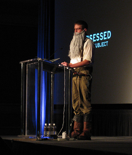
John Hendrix (as John Brown, above) was a hoot in his oh-so-believable beard and period outfit. He spoke of the trials of publishing his first picture book called John Brown: His Fight for Freedom. It was inspiring, and a lesson in persistence and passion.
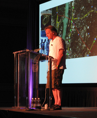
Istvan Bantai, author and illustrator of the book ZOOM, spoke of his disdain for being art-directed to death... he clearly has no use for changes to his work.
And Adam McCauley spoke about his experiences publishing his books, such as Mom and Dad are Palindromes and Oh No, Not Ghosts.
Out of the Box: Original, Non-Traditional Creative

©Thomas Blackshear
Thomas Blackshear is one of my favorite illustrators. I had the good fortune of meeting him early in my career, and I've followed his work ever since. He spoke of his career and his transition from strictly print illustration to the world of collectibles. He has become a major brand in the collectibles market, creating everything from plates for Franklin Mint, to figurines to jewelry. I mean, just look at that Kong painting. How could you not love this guy?
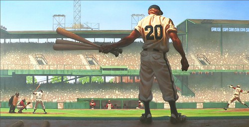
©Kadir Nelson
Kadir Nelson is a rising Superstar in Illustration. He named Blackshear as his mentor, and he has become a force in the world of Books, Children's Books, and Postage Stamps. He fearlessly showed some of his childhood drawings and spoke of his early influences. I got a chance to meet him after his talk and was very impressed with his kindness and humility, not to mention his awesome talent.
Tim Biskup
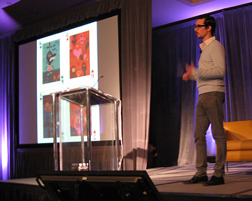
Tim Biskup was an unannounced speaker, and I didn't know what to expect when he took the stage, but I found his talk to be funny and inspiring. He shared stories of his upbringing and his influences, and encouraged everyone to "trust yourself...take that leap of faith and just create... paint what scares you!"
Kathy Altieri: Closing Keynote
Kathy Altieri is the Senior Production Designer at Dreamworks. She is responsible for a slew of hit animations, and she spoke about her role in those films, what inspires her, and the importance of being joyful in your work and in your life.
Then it was off to dinner and an early bedtime to catch the 4:15AM shuttle back to the airport. Yes, 4:15AM. Why? Don't ask me ... the concierge said that's when I needed to leave to be at the airport in time for a 7:30am flight. We arrived at the airport at 4:50am. The security check-in stations didn't open til 5am. Then we waited for 2 hours before boarding. Sheesh. Aaaanyway, it was an awesome trip and a terrific conference. I didn't see every speaker, and my camera died so I didn't get as many photos as I wanted, but other folks posted about their experiences there, and here are a few very good posts to expand upon this one and to fill in the gaping holes...
Aileen Holmes did a great job on her blog:
Day One
Day Two
Day Three
Here are some Facebook posts about the conference.
And Rod Hunt posted a great set of photos, here.
The biggie is by Thomas James of Escape from Illustration Island.
He shot video of most of the presentations and did interviews with many of the attendees. Poke around the site to get lots of info about ICON6 and just about everything else having to do with illustration. Great job, Thomas!




4 comments:
Wow-- Great post! I almost feel like I was there!
Truly inspiring and amazing post to equal an amazing time it must have been. Thanks for putting this all together Rick.
this is real inspiration. Thanks for all your precious time,Rick
wonderful post! Thank you for documenting the event with so many photos! I'm happy you benefited from my notes--thanks for linking me! : )
Post a Comment